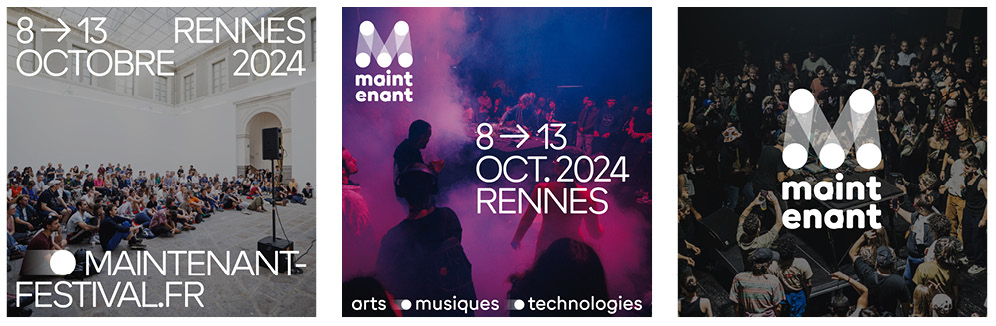
Maintenant · Festival graphic identity
Publish on 28 May 2024
- Catégories
In 2023, the festival celebrated 10 years of “Maintenant” after being named Electroni[k] in 2001 and Cultures Electroni[k] in 2004. A name that reflects the contemporary creativity that has been showcased for over 20 years in October in Rennes. The first decade of the festival’s existence was spent exploring innovative graphic systems, echoing the annual visual identity, imagined by an artist as a carte blanche, and presented as the festival’s first creation.
In 2024, Maintenant will undergo a transformation while conserving its ever-changing soul, and will adopt a durable and modular graphic identity. With the aim of transcending time, artistic projects and all the editions of the festival, KIBLIND and Pierre Picouleau have created an identity that will be constantly evolving to adapt to current and future creative works.
The logotype
Created by KIBLIND Agency
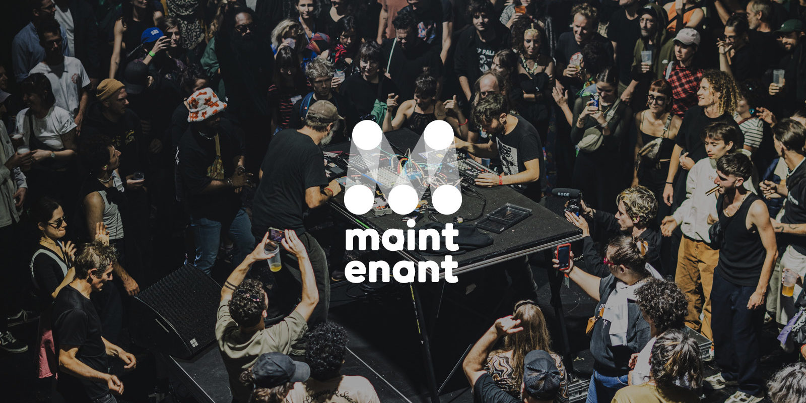
The logo designed by KIBLIND Agency draws an ‘M’, a combination of points and lines, between stability and mobility, opacity and transparency. A graphic sign that suggests both light beams and measuring tools. At once playful and elegant, it draws its inspiration from the optical codes to express itself in the scenic, artistic, scientific and digital fields.
![]()
It begins with the dot, the source of all creation in all art forms, a form that is universal and whose representations and uses are infinite: a figure of convergence and gathering, as well as a musical indication that increases the value of a note. It also evokes the virtuous circle of creation. The connection of these spheres via lines traces a movement and creates zones of intersection and nuance as though to affirm the obvious porosity and cross-fertilisation between contemporary cultural practices and artistic disciplines. These meeting points also reflect the determination to encourage and cultivate links between artists, venues and audiences.
Behind the beams of light, it’s a showcase for emerging creativity but also a spotlight on creativity expressed in all its diversity: so many views and visions of the world that are presented, shared and spread, like the profusion of a light spectrum that can contain an infinite number of colours.
This symbol is also a reference to the multi-angle measuring ruler used in mechanics and a nod to the technical dimension and the playground offered by the festival, always on the lookout for the appropriate angle and framework for each proposition. It’s a logo that can be articulated and disarticulated as desired, like so many adaptations to the current situation, a creative toolbox in tune with today’s challenges.
![]()
The typography
Rounded, created by Bureau Brut
The story of a beautiful contradiction. If you walk around a circular shape long enough, you might tend to make it square. And that’s exactly what happened with the ‘Round’ typeface. The angled shapes of the ends and the elegant simplicity of the rounding evoke a modern, fluid geometric approach to design, moving from round to square and back again. (…) When used in small sizes, the corners are optically transformed into a rounded caress. Round’ is not round, nor is it really a geometric or humanist typeface. It’s something in-between and more complex: an exploration in design where a physical object, in this case a marker, has determined the numerical form and design of a font that mimics life and influences the way we look at the world around us..
Bureau Brut
The choice of this typeface to accompany the logo and all the communications of Maintenant was motivated by its ingenious spirit and clever design. To preserve the friendly feel and warm texture of the characters, a high-precision (almost surgical) optical adjustment has been made to follow the skeleton of the letters and the angle at which they were cut. Born from the tension between the geometry of abstraction and the humanism of calligraphy, Round is not really a circle. The individuality of the tiny letters is manifest in its verticality, which run through the circles, creating dynamic and energetic typographic interactions.
With its unique, delicate and rounded shapes, it offers a wide range of weights (14 styles) for all-round integration and immediate legibility. This font rounds off the angles and, like the festival, shows that a circle can fit into a square. Used in small texts, the corners are transformed by an optical effect. A typeface that exudes freshness, adaptability and fluidity.
The graphic system
Created by Pierre Picouleau
To accompany the new logo, Pierre Picouleau has designed a graphic system that delivers on the promise of a strong, accessible and flexible visual identity. Flexible and adaptable to the codes of its time, it fits in harmoniously with the emblematic artwork of each edition, which remains at the heart of the festival’s visual identity. It is superimposed, transparently, on the image to allow the visual content to speak for itself, and serves the artists and projects in an elegant and effective way. Its neutral, brutalist aesthetic makes it easy to play with the compositions, without compromising its legibility.